

This post uses affiliate links at no additional cost to you! By clicking the links in this post, I earn a small commission should you make a purchase. Thank you in advance!
Updated 8/7/2023
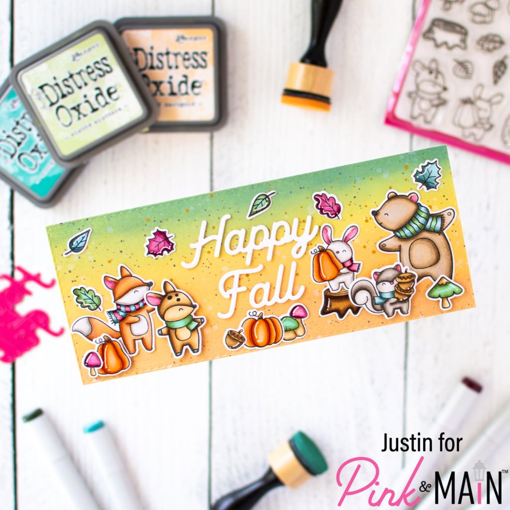
If you’ve been following me, then you are probably aware by now about my love for Ranger Ink’s Distress Oxide line by Tim Holtz. When it comes to blending seamless backgrounds, these inks reign supreme in my personal opinion, and I naturally couldn’t resist having “complete set” syndrome with them!
For inks, there are generally 2 main types of ink. One is a Dye Ink, which is a vibrant ink that dries quickly. The 2nd is a Pigment Ink, which takes a bit longer to dry. But, when it comes to Distress Oxide Inks, they really are their own category, as they find a happy medium between the 2.
Currently, there are 72 colors in the Distress Oxide Color Family, and I am taking on the task of ranking them in order of my personal favorites. Now, I am taking a lot of factors into account, and will include brief explanations of my rankings under each ink.
I want to set some precedents for this blog post:
- I am a huge proponent of the use of all Distress Oxide colors. Even if a one of your favorite colors ranks lower on the list than you think, I urge you to not assume that I dislike the color.
- I do own all 72 full-size Distress Oxide colors and am speaking from personal experiences with these.
- At the end of the day, these rankings are based upon my own opinions through my own use of them. Items taken into consideration in my rankings are: how often I’ve used them, blends they lend themselves to, necessity amongst other Distress Oxide colors in the same family, colors I am personally drawn to the most, etc.
- This blog is not sponsored by Ranger, Tim Holtz, any affiliate-linked company, or any sort of craft-related company. While I may receive product as a gift to use at times, there is no agreement for me to create this content. This blog was created on my own with the intention of sharing my own thoughts. Please be aware, though, that affiliate links are used in this post, which, at no additional cost to you, generate a small commission for me should you make a purchase through the link!
This post is a labor of love, and I am so excited to be sharing it with you. So, here we go!
Rarely Used Inks
#72 Victorian Velvet
I have to be honest. I think Victorian Velvet may be the only Distress Oxide Color that I own that I haven’t used. My projects tend to have a vibrancy to it, or some sort of scene building element, and I just don’t find Victorian Velvet fitting into either of those categories well for me. I do, however, see the appeal to this color when using it in a floral-themed project, as it gives off a pretty dusty pinkish purple color that could capture some flowers perfectly.
#71 Tattered Rose
I feel like Tattered Rose and Victorian Velvet would probably be used in a lot of similar blends, so I’m guessing that my placement of it on this list is that it has a lot of similar qualities in comparison to Victorian Velvet. I do like that Tattered Rose has a very defined pink shade, but when it comes to light pinks, I just find myself reaching for Spun Sugar more. And, with it’s color name, I also think this one would work beautifully with some floral projects
#70 Antique Linen
For me, I just don’t find myself reaching for Antique Linen very often. This color is in between super light shades of yellow and brown (though, probably more on the yellow side). Scattered Straw is probably the closest color that I find myself more inclined to using.
#69 Old Paper
I think Old Paper has some similar qualities to that of Antique Linen. I do like, however, that it has more of a green hue to it. I just don’t find myself reaching for this pad very often.
#68 Tea Dye
I feel like Tea Dye is one of those OG Distress Colors. Now, I haven’t gone into the history of the Distress Family of Products, but I’ve often felt like the whole point of the inks were, originally, to give that distressed look to paper, and that style is captured by Tim Holtz’s style so incredibly well. And, I would tend to believe that the original intention of this shade was to actually make a piece of paper look tea-stained! I think that I would enjoy the Tea Dye Distress Ink more than the Distress Oxide, because the Oxide color gives me a subtle earthy peach color. Again, just not something that I find myself reaching towards that often.
#67 Shabby Shutters
I like Shabby Shutters, I just don’t find it being a green that I often reach for. I would say that it’s a shade darker than Old Paper, so I’ve ranked it higher because I am getting more green from it. I think it would work well as a light color in an earthy green blend, and that’s just unfortunately not a blend I often create with.
#65 Pumice Stone
In my home life, I live for grays. I think they make for such sharp designs. I just think that Pumice Stone is a tad light for my liking, and that I haven’t found a way for me to fall in love with it yet. There really are only 2 colors in the Gray Distress Family of Colors, and I find myself reaching for Hickory Smoke more than Pumice Stone.

#65 Weathered Wood
Weathered Wood is an interesting color for me. It gives you a gray from the packaging, but really also fits in with the blues as well. I think the reason that I’ve ranked Weathered Wood as #54 is that I just don’t have a ton of use for it. I think it would work wonderfully as a blend between Pumice Stone and a color like Speckled Egg, Iced Spruce or even maybe Stormy Sky.
Occasionally Used Inks
Would you believe me if I said that this is where I started to struggle creating this list? I only checked off 8 colors, and already began to find this process difficult. Please remember that a lower ranking does not mean I dislike the color, it just means how I personally compare it to the other colors available!

#64 Speckled Egg
Speckled Egg is one of the newest members of the Distress Color Family, and it’s pretty! I mean, who wouldn’t love a new gray blue color? I think I see Speckled Egg as more of a gap color between Blues and Grays, similar to Weathered Wood, so I have limited use for it when comparing it to similar Distress Colors. I will say though, this color would make for an amazing wall color, and I am excited to find more use for it as I create more Distress Oxide projects!
#63 Peeled Paint
Peeled Paint offers a good mid-tone for natural greens. I think it bridges a lot of the green tones together, and that’s what I’ve used it for.
#62 Forest Moss
I think that, up to this point, you are seeing that almost all the colors listed above have an earthy element to them, and Forest Moss is no exception. I actually think that Forest Moss is one of the absolute earthiest of the Distress Family Colors. It gives you that super dark brown green that really is pretty and allows for beautifully blended forest scenery. Most of my forest scenes have a more vibrant green choice, but Forest Moss really is a beautiful color if you’re going for a more natural, or even some spooky forest looks.
#61 Spiced Marmalade
Spiced Marmalade was the very first Orange Color from the Distress Family that I purchased. I hadn’t done much research, but it had looked, at the time, that Spiced Marmalade was the closest I would get to a True Orange color. I was wrong (that title is claimed by Carved Pumpkin). It’s a pretty Orange, but is more of an off mid-tone that often only find myself reaching for when I want to blend into or out of Dried Marigold or Carved Pumpkin.

#60 Shaded Lilac
Shaded Lilac used to be one of my go-to’s. But as I accumulated more and more Distress Oxide Colors, I realized that Shaded Lilac sort of stands in a league of its own. In my opinion, it’s the only true Blue Violet shade in the entire Distress Color Family, and I find it hard for me to pair it with other colors. I am crossing my fingers that another Blue Violet is making its way into the Distress Color Family soon, though!
#59 Iced Spruce
I think that Iced Spruce is such a unique color. It’s like a “Steel Teal” of sorts, and really lends itself well to wintery scenes. I haven’t seen myself pull for it outside of wintery or outdoor setting projects, so it’s placement on this list is due to frequency of use.
#58 Worn Lipstick
I do like Worn Lipstick as a color, and, quite honestly, I think that it is perfectly named. There is something about it where I feel that you can see a mix of a skin tone, or almost like you can tell that it’s a color sitting on top of lips. I wish that it say more evenly between Spun Sugar and Picked Raspberry, but Worn Lipstick is a worthy pink that absolutely has made its way into a lot of projects of mine.
#57 Ground Espresso
Ground Espresso is a very warm and dark brown, that is honestly one of the most beautiful of the browns. However, with how dark and rich the color is, I find myself limited to its use. When it comes to browns, I often use them more for distressing the edge of a die cut or portion of my project, and less for blending up an ombré background, and there is just some very stiff competition when it comes to the Distress Family Browns.
#56 Frayed Burlap
Frayed Burlap is probably the closest Distress Family Color to Taupe that you’re going to find, so one could argue it could be one of the most trendiest when you think of design (more so interior design) I have used Frayed Burlap a lot, but just not as much as the browns that precede it.
#55 Stormy Sky
As a whole, I think the Distress Family Blue Colors are my favorite group. There are so many beautiful shades to pick from. While I love them all, I think I find Stormy Sky one of the more limiting options, using it only when I want to create more of a muted sky blend. Which, hey, I do from time to time. But also, I like to use skies as a statement piece in my projects, and this color sometime makes them less striking, though still beautiful.
#54 Aged Mahogany
The ONLY color that I feel truly captures the essence of Maroon, Aged Mahogany is a rich addition to the red end of the Distress Family Color Spectrum. Because I find it so dark, I only find me using it on occasion. But it really does make for some amazing warm-tone projects.
#53 Bundled Sage
In the realm of the Lighter Natural Green Distress Family Colors (phew, that’s a mouthful), Bundled Sage is my favorite. It is named perfectly, and has a softness to it that I truly appreciate when creating.
Note: If this was a Distress Ink post, Vintage Photo would rate SO much higher on this list. But in terms of my Oxide usage, this is where it falls.
#52 Gathered Twigs
Gathered Twigs is a great color when you are looking to blend up some more muted wood-tones. Gathered Twigs does have a bit of a taupe feel to them to the slightest degree, so it’s really good for when you want a little bit of gray with that brown!
#51 Broken China
Broken China was one of the very first Distress Oxide Colors that I purchased. At the time, I was fairly new to crafting, and didn’t do a lot of research as to where I could purchase the inks. I found that a local big box retailer had a small selection that I could order online for in-store pick-up, and that’s how Broken China became my very first blue shade that I purchased. I’ve already expressed my love for the Distress Family Blue Colors, and of course Broken China is included with that. I initially purchased the ink because I thought it would be the truest blue (very similar to my Spiced Marmalade story), and I found I was wrong (that title would go to Blueprint Sketch). I just find myself less inclined to reach for it as time has gone on.
#50 Saltwater Taffy
Saltwater Taffy really captures that peachy salmon color quite well, and is going to lend itself well to a lot of your warm color blends (or cool color as well if you’re feeling adventurous)! The reason I don’t have it ranked higher on my list is that peach isn’t a color that I commonly craft with, BUT I know that having this on hand will be perfect for the moments that I’m looking for the right peach-tone!

#49 Crushed Olive
So, olives are one of my least favorite foods, but I am happy to report that I like this color more than it’s namesake. I think that this color brings together some earthy yellows, greens, and even possibly a tad bit of lighter browns. I call Crushed Olive my “earthy lime green” color!
#48 Rusty Hinge
Rusty Hinge is such an interesting color, and I think that is because rust, itself, is very interesting. I originally thought Rusty Hinge lent itself to more of the Brown Color Family, but it really is more on the Orange end. I think this color makes so much sense to be included in the Distress Family of Colors, I just don’t find it being a go-to of mine.
#47 Fired Brick
Fired Brick was one of the last colors that I added to my Distress Oxide collection, and it really gives you a nice distressed Red look. I tend to go to the other 2 main reds in the family (Barn Door and Candied Apple), depending on the look I am going for, but this is a great color to add to your Oxide Arsenal if you’re wanting a more muted red look.
#46 Fossilized Amber
You all are getting some “way back” stories with this list, and you’re going to get it with Fossilized Amber as well! This was the very first Yellow member of the Distress Family I acquired. At the time, I didn’t realize that there is just a small pinch of brown, which, honestly, keeps me away from using it when I’m going for a true Yellow look (that’s more in the Mustard Seed realm).

#45 Faded Jeans
Faded Jeans is the option that I use if I need a darker, yet less vibrant, blue in my blends. I’ve used it before in both water and sky blends, and it works beautifully. Plus, I am such a sucker for a denim look, and feel this color would work perfectly with some of those fabric print/knitted stencils for an even more intense denim look.
#44 Scorched Timber
The final addition to the Distress Color Family Line-Up!! This color is so bittersweet, and also adds a fun earthiness to our distress options. Personally, I feel like Scorched Timber has some green in it, which is an interesting direction for a brown earth tone to go in! I think it really stands alone in terms of being compared to other browns, but I just know how wonderfully it will blend with those earthy yellow greens like Forest Moss and Peeled Paint!
#43 Dusty Concord
Another perfectly named color, as it truly reminds me of a slightly more gray version of Concord Grape Jam. I feel like if you’re going to use Dusty Concord, Seedless Preserves can often be used in its place, and I tend to lean towards Seedless Preserves more often. But I just love that Dusty Concord does lend itself to some beautiful sky blends, and both Fall and Winter seasonal blends as well!
#42 Crackling Campfire
What a great color to be added to the line-up. Crackling Campfire goes a notch beyond Ripe Persimmon, and becomes the reddest of the oranges in the Distress family (my opinion, at least). The name is absolutely perfection for it, as it lends itself so well to any sort of fiery, fall, or warm themed blend!
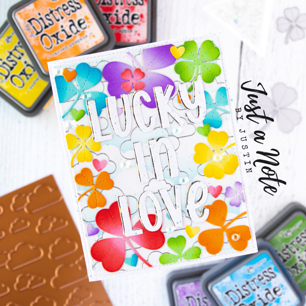
#41 Lucky Clover
Lucky Clover is another ink that gets an origin story very similar to those before it. I purchased Lucky Clover with a limited knowledge of Distress Colors available, and thought that it would be the truest Green. In short, I was wrong, and because of that, I don’t use Lucky Clover as often as I originally thought. But it is still a lovely deep green color, which definitely leans more towards the bluer end of greens than yellow.
#40 Blueprint Sketch
The title of True Blue totally goes to Blueprint Sketch. It is, essentially, the textbook definition of Blue. You can get some beautiful sky and water blends using Blueprint Sketch, and adding it to your collection can really amp up your projects. I will say though, that I have enjoyed using the newer Prize Ribbon color a smidge more over this shade, as I feel like that slight lack of vibrance really captures a lot of my creations!
Commonly Used Inks
Phew! Half way there, and I think this is a good point to throw in my thoughts about where we are at in this process. The inks that have been listed up to this point are, for the most part, great between colors, but generally not colors that I would recommend for beginners to add to their collection. From this point on, I am providing my Top 39 Distress Oxide Colors, and would recommend that anyone starting their collection look at these colors first!
#39 Dried Marigold
A lot of times, when I blend up my inks, I like to have what I call vibrant tones (more of a true color) and muted tones (more of pastel color). Dried Marigold fits the bill well for a pastel orange. I have used Dried Marigold more than I originally expected, especially when going for a pastel rainbow look, or needing to blend from lighter yellows into an orange at time.
#38 Barn Door
I’m a sucker for reds. Really, I am. I feel like Barn Door is a good mid-list placement holder. For standard Reds, I feel like there is Candied Apple on one end, the vibrant and bold choice. There’s Fired Brick on the other end, which is the more earthier choice. And then, you’ve got Barn Door right in the middle. So you’re probably not surprised that I tend to lean more towards vibrant than earthy tones. However, it’s a great red nonetheless.

#37 Evergreen Bough
If there is a Color Family that I am a sucker for, it’s Blue Greens. Including them in your sky and/or water blends just really can make your project pop! With Evergreen Bough adding a tad bit of festiveness to your project, It’s a great color for your collection.

#36 Scattered Straw
The most muted of the Yellows, I’ve found myself reaching for Scattered Straw more often than I would think. It is the perfect yellow to use for the moon at night, and blending it on top of other inks used for sky blends, it can make your moon even glow a tad. I’ve also found that it checks the Yellow pastel box.
#35 Abandoned Coral
Abandoned Coral is the most pastel Red that’s available in the Distress Family Colors. It packs a little bit of pink in it as well (hence the coral name), and I’ve found myself reaching for it a handful of times.
#34 Festive Berries
If I was to create a category of unique colors, Festive Berries would absolutely be thrown into the mix. By the packaging, you’d think this color lends itself more to be a pink, when, in actuality, it’s more of a red. You’d also think that it is a Christmas/Holiday go-to, but I believe it has much more use outside of winter holidays. Its mid-list placement is due to me loving the concept of the color, but ending up getting similar looks with other ink colors when blended together.
#33 Milled Lavender
I don’t get super excited with Milled Lavender, but it is the best lighter Purple options available. Because of that, I reach for it often. I also use this as a pastel Purple too. I find Milled Lavender more able to be used with the other Purples than Shaded Lilac.

#32 Mermaid Lagoon
Mermaid Lagoon and Salty Ocean are those identical twins, who technically are fraternal twins because there is a small difference between them that you have to stare at for a while to find. I can’t, in good conscience, rank Mermaid Lagoon much higher than here because that small difference causes me to reach for Salty Ocean more. And it really comes down to Mermaid Lagoon having just a tinge more earthiness to it.
#31 Ripe Persimmon
I am a sucker for a good Persimmon color (it is, in fact, the color of my Cricut Explore Air 2!), and Ripe Persimmon is a wonderful color. It works well with all of the colors on the warmer end of the Distress Family Color spectrum too!

#30 Prize Ribbon
It’s true, I’m a huge sucker for blues. Prize Ribbon is the most recent color added to the Distress family line-up, and I think it’s the blue we didn’t know how much we needed it. If I was to nestle it between any 2 Distress colors, it would probably be Salty Ocean and just a smidge lighter than Blueprint Sketch. It’s going to make those sky blends look gorgeous!
#29 Lumberjack Plaid
Festive Berries really is a great red violet, and I was thrilled to see Lumberjack Plaid added to the mix to add a darker shade to the Distress Color Family! This color is absolutely perfect for Christmas and Winter Holiday crafting, and also is great for masculine-themed cards as well! Plus, given it’s namesake, you just HAVE to use it for some sort of plaid background!
#28 Pine Needles
For those of us who love blending up those tree and forest scenes I’ve talked about earlier, Pine Needles is a must. It leans more towards the blue end of the Distress Family Color spectrum, and I am also calling it a member of the Distress Family Color Holiday Troupe (joining Festive Berries and Evergreen Bough). It is also the darkest of the Greens without having much of an earthiness to it.
#27 Lost Shadow
The newest addition to the Distress Color Family, Lost Shadow, is absolutely amazing. This silvery gray is a neutral and really pairs it self well with both warmer and cooler tones, which is going to make it an incredibly versatile color in your Distress Collection, particularly the Oxide Ink!
#26 Wild Honey
Truthfully, this color may not be a need based off of its utility. It sits between the Yellows and the Oranges, and Wild Honey is really representative of a Gold. But the reason of its higher placement is because it’s just so pretty and a great addition to your collection.

#25 Squeezed Lemonade
Now, I know that I mentioned Scattered Straw as being a pastel in the Yellow Family, but depending on the look you’re going for, Squeezed Lemonade could give you that pastel feel as well. Squeezed Lemonade packs that vibrancy you would expect from a color that mentions lemons, and I use it the most in cartoony settings.

#24 Brushed Corduroy
I feel like this may be one of the more shocking placements on the list, because something tells me that Brushed Corduroy may be a Distress Family Color underdog. But let me tell you, Brushed Corduroy is one of my most favorites overall, and especially of the browns. It blends up the most perfect ground tones, and works the BEST for sandy colors. Brushed Corduroy is a need for anyone who uses their Distress Oxide Collection to help create scene cards.
#23 Rustic Wilderness
When comparing colors side be side, for me, Rustic Wilderness is the better Pine Needles for my own use. Now, don’t get me wrong, I do love Pine Needles, but where Pine Needles goes a little bit more towards blue, Rustic Wilderness goes a little but more towards yellow, and that’s how I’ve grown to love my greens! You’re going to need this color for any sort of woodsy themed card, and it will work wonders to shade your green die cuts with!
#22 Villainous Potion
When Villainous Potion was announced in October 2021, my Distress Oxide loving heart fluttered with so much joy. I had been WAITING for a new purple to be added to the line-up, and this one was so perfect! Now, since it is a darker tone and if you were just starting your Oxide collection, I would not say this is the first purple you need (or really the 2nd), but you are definitely going to need it in due time!
#21 Cracked Pistachio
Cracked Pistachio is a secret weapon of mine in crafting. I think that Cracked Pistachio is one of the Distress Family Colors that really changes when used as a Distress Oxide in comparison to a Distress Ink. I love using Cracked Pistachio as a sea-foam color in my ocean blends, and it really makes that top layer of water almost look like the sun is dancing around inside of it. Cracked Pistachio used to be in my “Must Haves” Category, but since the addition of another color, it just got moved down the list a bit.
#20 Spun Sugar
The cotton candy vibes with this color are REAL. Spun Sugar offers the best pastel Pink option, in my opinion. I have used Spun Sugar on so many projects to add a magical effect to it. There is just something about taking a soft pink and blending it out in an ombré will not disappoint!
The Must Haves
I really wanted to narrow my “Must Haves” section down to the Top 10, but just can’t bring myself to it. So, these next 19 inks are the best of the best, in my eyes. You will find yourself reaching for them the most as they pack the most utility, and I have also ensured to include at least one color from each of the main groupings.

#19 Uncharted Mariner
Blue-greens are probably my favorite color family ever, and I cannot even begin to describe how excited I was when Tim announced the Uncharted Mariner Color in mid-2022! For everything that I love about Chipped Sapphire, Uncharted Mariner gives that slightly green-ish look to it that just makes my heart swoon! This color is going to act as a perfect darker shade to Peacock Feathers, one of my all-time favorites as well!
#18 Walnut Stain
Maybe Browns aren’t the most exciting colors to reach for, but Walnut Stain is going to be one of the best colors to reach for when wanting to distress the edge of your project. It’s dark enough to hold well on it’s own, but not too dark that it will overwhelm a project (hence why I placed Ground Espresso earlier in this list).

#17 Hickory Smoke
I’ve said it earlier in this list, but I just love grays. And Hickory Smoke is the best of the 2 grays, in my opinion. I use it often to distress the edges of a die cut, and have used it with some spooky blends as well.

#16 Kitsch Flamingo
As I’ve grown into my “craft” (literally), I’ve really come to appreciate pinks! I was super excited when Tim announced the addition of Kitsch Flamingo to the line up, as it was a perfect mid-tone to use between Spun Sugar and Picked Raspberry! Where I have always felt that Worn Lipstick had a bit of earthiness to it, Kitsch Flamingo has more vibrance, and it was very quickly a color I knew I could utilize in my stash!
#15 Twisted Citron
I think Twisted Citron is my favorite Green of the Distress Family Colors (though it’s not the highest ranking green out of utility). Twisted Citron brings a smile to my face when I use it. It can be used as a wonderful vibrant Green on its own to really bring your leafy and grassy elements of a project to life. You can also use it with so many other colors to blend up a picture perfect ombré.
#14 Mowed Lawn
If you need to reach for a green, Mowed Lawn should be your go-to. It works so well with with essentially all of the other Greens, but probably works the well mostly with the earthier ones. I use Mowed Lawn the most in conjunction with Twisted Citron to blend up grass or tree elements.
#13 Vintage Photo
Can you believe that when I first published this post, I had Vintage Photo as #46?! Overtime, I have grown to LOVE this color so much. It has become my perfect brown. Such a great midtone for so many great projects. Vintage Photo truly feels like a staple in my Distress Oxide collection!
#12 Wilted Violet
Wilted Violet is the truest Purple, which makes it a necessity in your Distress Oxide collection. I love the vibrancy of Wilted Violet, and have found myself reaching for it on many projects. There is one purple tone, however, that edges it out, and I will get to it later on this list.
#11 Carved Pumpkin
Another “truest” award, and this time we’re talking about Oranges. You will get so much use out of Carved Pumpkin, especially once Fall rolls around. I love the vibrancy of this color, and how it blends so well into others.
#10 Candied Apple
The best Red of the Distress Family Colors in my opinion. I’m going to go out on a limb and personally argue that Candied Apple is probably the most true of the Red’s as well. When I think of reaching for a Red, Candied Apple is my go-to, and I think it will be your’s too!

#9 Salty Ocean
One of the absolute most versatile of the Blues, Salty Ocean is probably next in line for the “True Blue” award, next to Blueprint Sketch. Like it’s name, it works incredibly well with underwater blends, which is one of my absolutely favorite scenes to blend together. It has amazing sky usage as well, depending on the colors you’re going for.
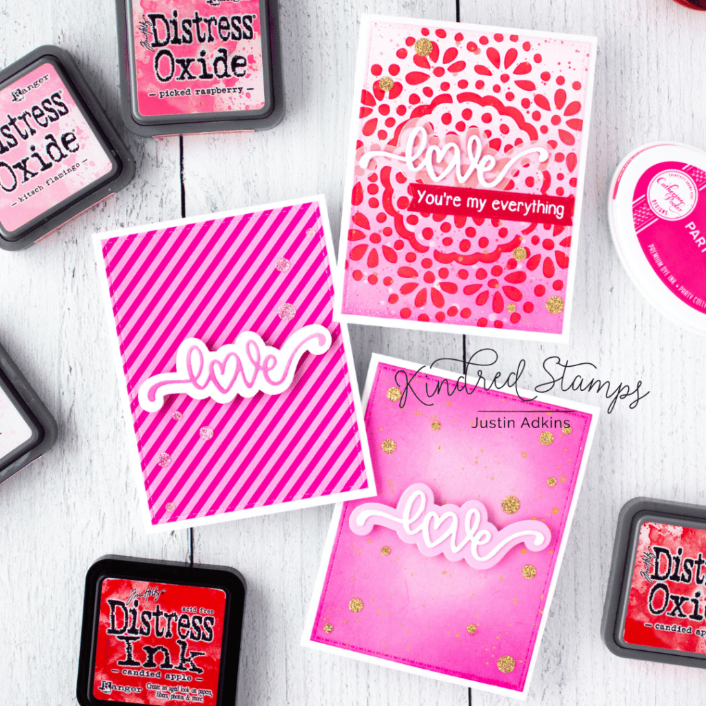
#8 Picked Raspberry
I surprised myself with having a Pink rank so high on this list, but Picked Raspberry is really the most stunning shade of vibrant Pink that’s offered. I’ve seen this color be extremely versatile, using it with Valentine’s Day projects (the obvious) all the way to wintery projects as well in conjunction with Spun Sugar. I highly advise picking up this color, and then also consider adding it’s more pastel sibling to your collection for use as well.

#7 Mustard Seed
I added Mustard Seed sort of late to the game in my Distress Oxide collection, and I’ve always kicked myself as to why. In fact, it may be the only Distress Oxide pad that I paid full retail MSRP price on (gotta love those coupons, ya’ll). Mustard Seed is the truest of the Yellows, and it’s, yet another, color you will find yourself reaching for often. I love how bright and sunny this color brings itself to be, and love using it as a surprising addition to a sky blend.

#6 Chipped Sapphire
I’m going to say that Chipped Sapphire is about the closest you’ll get to Navy, and you may think having it so high on the list is a misplacement. But hear me out. If you are a night sky blender, this color is a must. I reach for my Chipped Sapphire ink so often, and it’s really able to darken the edges on cool-toned projects so perfectly. I personally feel like I would be doing a disservice to you if I put it outside of the Must-Have category.
#5 Black Soot
Black Soot is in this “Must-Have” section for a very similar reason to Walnut Stain. It’s not exciting really… It’s just a black. But the utility of this color is just astounding. I use it all the time to distress the edges of cut out, or even use it in a night sky blend on top of Chipped Sapphire when I really want it to be dark. Also, heavily consider adding the Black Soot Distress Ink to your collection as well, as I may even use this color more in its Distress Ink form.

#4 Peacock Feathers
Peacock Feathers is just the most stunning of the Blue Greens. I love reaching for this color, and it blends just the best into the Blues as well. I don’t know if I would say that this color packs the most utility, but it’s placement on this list is for it’s beauty and me being a sucker for an amazing Blue Green color.

#3 Salvaged Patina
I think the Crafting World sang praises of excitement when Tim revealed the Salvaged Patina color in April 2021. This color is literal perfection when it comes to the perfect blue-green. This color lends itself to be used so perfectly both with blues and greens separately, and together, and even allows itself to be used well with rustic blends. Salvaged Patina is an absolute must have!
#2 Seedless Preserves
Seedless Preserves fits itself into so many of my ombrés with perfection, and has alway been a great bridge for me in terms of connecting warm and cool colors together. It is the richest of the Purple colors, and the warmth from this shade just makes me squeal with excitement when it lends itself to another seamless blend. This may not be the truest of the Purples, but I am confident you will quickly understand my love for it (side note: pairing it with Salty Ocean, Picked Raspberry, Carved Pumpkin and Mustard Seed for an ombré may make you swoon). And, if I was ranking this list based purely on most beautiful color, I think that Seedless Preserves would take home the Grand Prize.

#1 Tumbled Glass
Now, not to take away from Tumbled Glass’s moment, but it’s placement on this list is out of utility. Skies are probably the #1 item that I find myself blending up, and I would be lying if I said that, any time a Blue is involved, it’s Tumbled Glass. This color lends itself to being the softest of shades, and will also probably be the first Distress Oxide Reinker you will need to purchase as well!
PHEW! And there you have it! All (current) 71 colors, and more on the way! Of course, I want to mention one more time that these rankings are done purely on my personal experience with all 71 colors (and yes, I do own all 71).
But I would LOVE to hear from you! Be sure to drop a comment down below of what your favorite Distress Oxide color is!
This was truly a very informative writing, both to newbies and skilled alike. I found your color remarks to be spot on and it made me look at my oxide inks in a whole new way. Thanks so much.
Thank you so much for your kind words, Karen!! It’s fun to hear that we both have similar thoughts with the colors!!
This was really fun to read, thanks for sharing. It’s so interesting to see what ones you use frequently. So many of the more muted ones are the ones I definitely reach for more often. I love how different all of our styles can be and how it’s reflected in our color choices. Hope you are well friend!
Hello friend!!! First and foremost, all well here and I hope the same is for you!! I definitely am heavy handed with my vibrant tones… but I also like reaching for the darker tones as well when I need a shadow! I agree, I love that our styles can be different with these!! Crafty hugs!!
I loved this list! Justin, you were my go to guy who gave me great advice when I first started my collection -I think salty ocean is probably my favorite, and black soot is the one thing I own that I’m just not sure how to use well enough yet but I’m going to keep trying!
Thank you so much, Gina!! I’m glad I could help you in the beginning!! As you can see, I LOVE Salty Ocean!! It’s honestly almost just as important to me as Tumbled Glass because I use it so often! And I promise once you get more comfortable, you will see the utilization with Black Soot! Especially with Night Skies!
I love this list! I am going to have to go through my distress oxides and see what I have and what I don’t. I just ordered the first 12 when they came out, and the second 12 twelve when they came out and I don’t really think I have added to my oollection since. I actually only tried them once. They are on the shelf….waiting for me. I have been using my distress inks a little bit more though. I bought some make up brushes for blending and am having fun experimenting. Thank you for taking the time to type up this list.
There are so many different approaches for how you can add to your collection, and I was a little late to the crafting game to get them when they came out! My first pad was actually an accident… I had a friend rehome a Vintage Photo Distress Ink pad to me years ago when I was first starting to make cards. I have since misplaced it… but have it in a Mini Distress Pad Now! And you are so welcome! I’m glad you liked the post!! 🙂
Great read & fun list!
If we all sat down and did our own rankings, they would all be different!
How great that we don’t all like the same things as much and create the same things!
Your cards are blendtastic!! Thanks for sharing! 🙂
I agree so much with this!! What I really discovered by making this list is what my personal style really lends itself too! I’m so glad you had fun reading it! Thank you!
What a great blog post with some wonderful suggestions and combos! Thank you so much…I appreciate how long it must’ve taken you to do this!
You are so very welcome!! I’m glad you enjoyed it!!
That was a true labor of love! I was thinking of how I use these colors in comparison, so it was neat to see where you placed them and why. I have about 15 of the colors and this helps me figure out which I should add. I NEED Seedless Preserves!!! Thanks for sharing this!
Seedless Preserves is a MUST!!! Especially with fall right around the corner!! You will use it for some beautiful yellow to orange to pink to purple to navy blends (of course, sub out and skip colors as needed, but that is my FAVORITE way to use it). 15 sounds like a fantastic start and I’m excited to hear which ones you decide to get next! And thank you for reading!!
Really enjoyed your blog post Justin! Thanks for sharing your thoughts & evaluations based on your usage & preferences. Really helpful comparisons!
Thanks for making this, it was fun to read. My rankings would be opposite, as my favorite are Victorian Velvet, pumice Stone, Bundle Sage and so many more of the pastels… I never used my Blueprint Sketch and Rasberry 🙂
What a great list and your explanations of each. I found myself getting and using the full size Distress Oxide colors (21 so far) more than the Distress inks but found I like those too so started getting the mini distress inks. Seeing your list though makes me realize I do need Chipped Sapphire, Candied Apple and Mustard Seed in my arsenal of colors as well as Brushed Corduroy. Your blending of colors is fabulous.
Thank you so much, Ann!! I’m glad you enjoyed this list!! Chipped Sapphire is one of those colors that I feel gets underrepresented when it comes to finding it in person at one of those big box stores, but I use it so much!!
Great list, Justin! I love the description. You are spot on there. I am still growing my oxide collection so I will keep this in mind when getting new ones.
Thank you so much, Vita!! I’m glad it was helpful!
Thank you so much for your post. It nearly made me cry. I have such a hard time getting my inks into color groups so that I can use them. I’m colorblind so I struggle and stress doing paper crafts unless all my papers and inks are sorted by color group. I can tell the different shades but only when everything is organized into color groups (Blue, Purple, Pink, Red, Brown, Green, etc.) I have been searching for the Oxide groups and finally found your post. Now, I’ve got every color defined and can go about placing the ink color on the chart. Thank you! Thank you!
Thank you so much for your post. It nearly made me cry. I have such a hard time getting my inks into color groups so that I can use them. I’m colorblind so I struggle and stress doing paper crafts unless all my papers and inks are sorted by color group. I can tell the different shades but only when everything is organized into color groups (Blue, Purple, Pink, Red, Brown, Green, etc.) I have been searching for the Oxide groups and finally found your post. Now, I’ve got every color defined and can go about placing the ink color on the chart. Thank you! Thank you!
I am new to the distress inks, but had collected a huge number of the dye based distress inks with all of the reinkers. Reinkers are an absolute must have for any ink pad IMO. Due to the obvious popularity of the newer distress oxides, which I immediately fell in love with upon the first swipe with a sponge on chipboard, they are increasingly difficult to find, especially from any one vendor. I had a huge order ready to go with one vendor with a 19% anniversary sale discount. This made a big difference in my bottom line, but I fell asleep before finishing this order, which in itself was time consuming to put together, so I missed out on the discount. I wrote the company an email, hoping they’d honor their discount, but they offered a $5 coupon off of my $300 order! Justin, can you recommend a vendor where I can find a large number of TH distress oxide ink pads AND reinkers at a “less than full retail” price? I’m a crafter who needs to have all of her favorite colors at hand and fully inked!
Hi Kathleen! I’ve always felt that one of the most responsible purchases you can make as a crafter is to purchase a refill at the same time that you buy your ink pad or marker (needless to say… I don’t always make responsible purchases LOL). In regards to your question, I do know that right now that a lot of the Ranger Distress Oxide products have been out of stock across the market. For example, I have a friend who only needs Aged Mahogany to complete their collection, and are having a heck of a time finding it! In my experience, the Only One Life Creations website has been the best place that I’ve found who carries both Oxide Pads AND Refills at the best value. I don’t know if they have any low inventory colors in either offerings, but that would be my recommendation! If you are ever interested in separating your purchases, I do know that Joann’s offers a large line up of the oxide pads, that can very frequently be found at a discount, but I don’t believe they carry the refills.
I hope my suggestion of Only One Life Creations helps! They really have a great line-up of discounted product. Their shipping, in my opinion, is slightly above the industry average, unless you plan on spending above $150 which i believe is the free shipping threshold 🙂 please let me know if I can be of any assistance OR if you find a website with even better deals! I would love to know… you know… so I can be a more responsible crafter 😛
Thanks very much for your reply. Yes, indeed, I will meet the free shipping threshold! Thanks for the recommendation for Only One Life Creations. I will check there soon. I’m having a lot of fun unpacking my first (and large) order from Stampin’ Up, in which I purchased all of the dye ink pads AND reinkers along with them. I haven’t bought SU pads for 18 years now, and it’s pretty exciting to have 40 new pads with 40 reinkers! In the meantime, I’ve been collecting TH pads and I think his work and his colors are amazing!
Thanks again!
Justin, thanks for the lead! I’m starting my shopping with two windows open side by side, one with your list and the other with Only One Life Creations. They have the best prices I’ve seen so far, consistently 21-27% off the retail price. That beats the other one with the 19% sale that I missed out one by a few hours. Thanks again! Going to go buy Tumbled Glass and on up the list!
I forgot to mention. Send me your affiliate link if you have one for the above mentioned company.
You’re so sweet! Thank you! I don’t believe they have an affiliate program… but I’m so happy you’re pleased with the pricing you’re finding 🙂
I have a huge order ready to go with Only One Life Creations. There’s a space in checkout for a “coupon code.” Do you know of a discount coupon code for this company? My order is $278! I used your list, worked from #1 up, added all the reinkers for what I already have (21 including some of your least favorites!), and a few others I just had to have. Some stores have 10% or more but I can’t find a code. Thanks!
Hi Kathleen! No, unfortunately I don’t know any coupon codes at the moment. So sorry!
Your list was so important in deciding what to get for new colors. I had bought 21 from Joann.com but without reinkers. All in one stop, because of your referral, I bought something like 56 items for $263.75! I suggested they consider a referral program of some kind or establish an affiliate link. I had never heard of them before you told me about them, so you could surely boost their sales!
and benefit somewhat from the referrals.
This is too funny. I have 41 colors, only 2 of your least used group, 12 or your top choice list. I almost never use black in any of my work, so my least favorite color is black soot, and my most favorite is any shade of blue. Thank you for assembling this.
Well I would say you definitely have good taste!!! Lol! The blues and blue greens are really my favorites!! Thank YOU for reading!!
Hi Justin, just had to comment that I really enjoyed this post and appreciate the time and energy you invested to produce it. I ran across it while googling which distress color is most like kraft card stock, but have now Pinned it for future reference. I own every DI and DO pad and reinker, not that much of a fanatic about the stains, paints, etc. The color choices have always fascinated me. XOX
Great article! Love your perspective on the colors. Definitely will be buying more Distress Oxides, based on your advice. I thought I could get a way with just a few of them, but you’ve convinced me that I need more.
Thank you so much for your kind words!! I am glad this post helped!! Can’t wait to see which ones you add to your collection!
I need to go through mine to see what I have and where they rank on your list! Love your must have picks, I may need to order a few!
Such a wonderful help to this beginner, Justin. Thank you sooo much!
Thank you so much for your kind words, Juliette!
Do you own the Distress Inks as well, or just the Distress Oxides?
I do own both the Distress and the Oxides!
Do you also have all the Distress Inks? How are you using those vs the Distress Oxides?
I don’t own every color in the Distress Inks, but I do have all of the Oxides. I use the Distress Inks when I want a more saturated color, and also use the Distress Inks a lot when it comes to distressing the edges of paper/die cuts. Oxides I use mostly for ink blending multiple colors together! I also sometimes layer Distress Ink stenciling onto a Distress Oxide background. Hope this helps!
Thank you, Justin! You have helped me decide how to add oxides to my Distress collection of inks. I was just overwhelmed with all the colors and I used your list to chose what to go with first. Thanks again!
Interesting article. I own over 60 Distress Oxides; I also own maybe 30 regular Distress Inks, but don’t use them much because I prefer the blendability of Oxides. I used to think swatching was a waste of precious craft time, but now I love to swatch each new ink pad- this is often when I discover how I feel about the color. Turns out some of the ones I just had to have (like Tattered Rose) I don’t really care for, while ones I didn’t expect much of (like Mowed Lawn) are my most used. The ink swatches are also useful for pairing colors – Victorian Velvet pairs well with Dusty Concord, not Worn Lipstick or Picked Raspberry IMO. One day I’ll sit with Tattered Rose and decide what pairing(s) I do like, or Google blends others have used – who knows, it may become a new favorite.
While looking for a list of distress ink in text form and not .jpg, I came across this article. Not only was it helpful to me to make my own list of text for a spreadsheet, it was really informative! I’m going to pin it and refer back to it. Thanks for all your hard work in putting this together.
Once again, I referred back to those fabulous post! In swatching the distress inks, some are difficult to categorize into a color family. While I didn’t get all my answers here, I did get many. This blog post is amazing and such a great resource. I appreciate you!
So glad this post is continuing to assist you!
Wow! That was an impressive rundown of all 71 Distress Oxide colors! I really appreciate the personal insights and experience behind the rankings. It’s great to see someone who actually owns and uses all the colors giving their perspective. My favorite? Hard to choose, but I’d love to hear what others think too!