
Before we jump into today’s project, I wanted to let you know that I sometimes use affiliate links to share my favorite products. Don’t worry, these links won’t cost you a dime – they’re just little crafty helpers behind the scenes that help support me if you use them to make a purchase! Let’s dive into today’s creative journey together!
There’s something timeless about a cool, confident character with a little swagger—and the new Cartoon Kitty Stamp Set from the January Kindred Stamps release delivers exactly that. For this release, I created a pair of cards that show just how versatile this stamp set can be, whether you’re going playful and soft or bold and graphic.
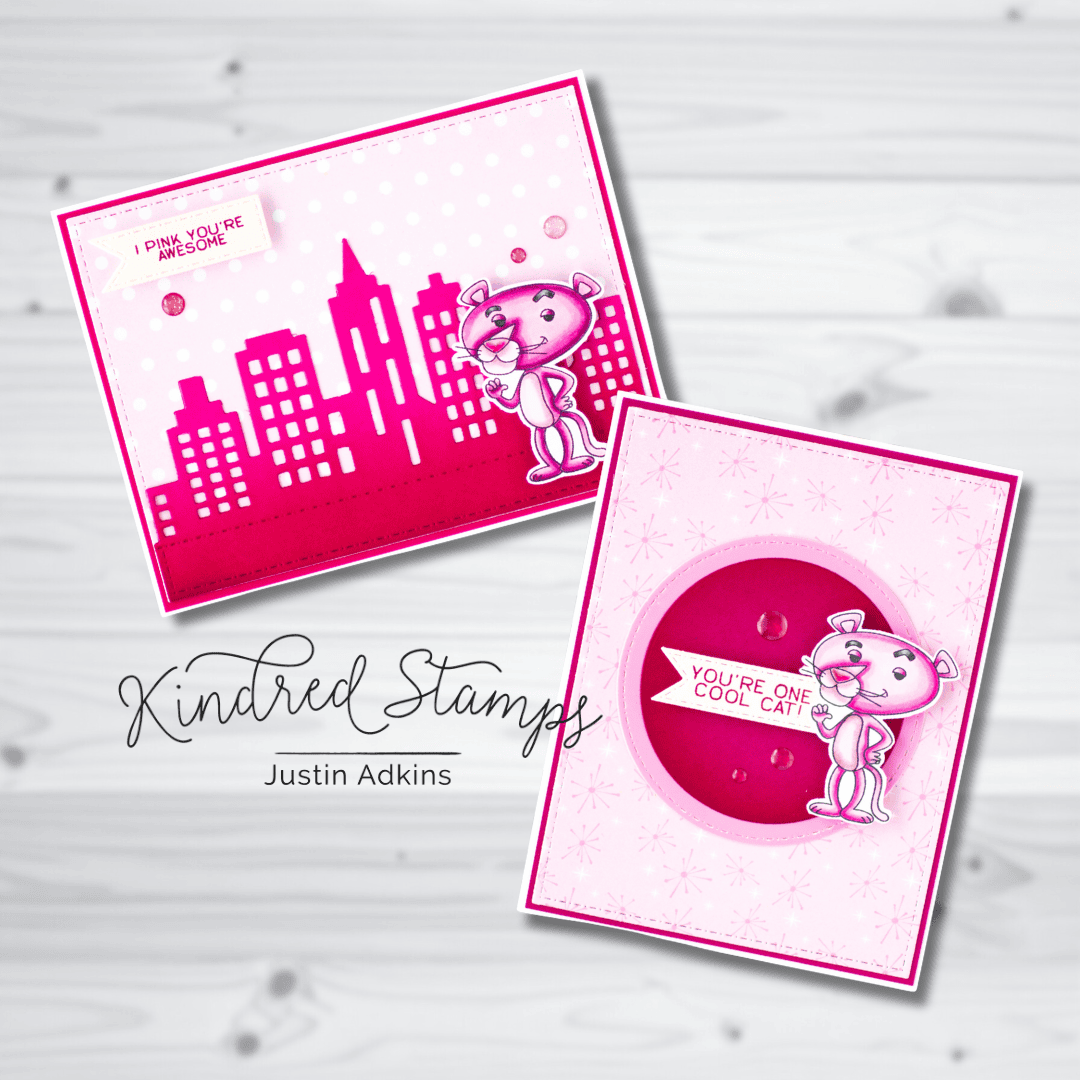
Both cards use the same main character, but with different scene-building approaches to give each design its own personality!
Why This Stamp Set Shines
What makes the Cartoon Kitty Stamp Set such a standout is its ability to fit multiple styles. With just a few changes in color, layout, or background technique, you can get completely different results while still using the same main image.
If you enjoy character-driven cards that feel playful, retro-inspired, and endlessly adaptable, this set is one you’ll reach for again and again.

Soft & Sweet with a Retro Twist
For the first card using the Cartoon Kitty stamp set, I leaned into a lighter, more whimsical look. A soft pink patterned-paper background sets the stage (thanks to the Retro Diner Paper Pad), layered with subtle pattern stamping to add interest without overpowering the focal point. The circular die cut from the Card Basics Die Set helps draw the eye straight to our cool cat, who’s perfectly placed to interact with the sentiment.
This design is a great example of how tone-on-tone colors can add texture while still keeping a clean and approachable feel. It’s ideal for encouragement cards, friendship notes, or anytime you want something cheerful with a touch of personality.
Design Tip:
When working with soft color palettes, keep your focal image slightly darker or more saturated so it stands out clearly against the background.

Bold Color & Graphic Impact
The second Cartoon Kitty card takes the same character in a completely different direction. Here, I went bold with a vibrant pink cityscape silhouette to create a strong, graphic backdrop. The clean lines of the skyline paired with a simple polka-dot background make the character pop while still keeping the design cohesive.
This card shows how easy it is to build a scene using die cuts while letting a stamped image remain the star of the show. It’s a fantastic option for masculine cards, encouragement, or just sending a confident “you’ve got this” vibe.
Design Tip:
Silhouette dies, like the Cityscape Border Die, are perfect for adding depth quickly—use a single bold color to keep the design striking and uncluttered.
A Bit of Coloring Assistance:
This image is pretty easy to color-up, and I have a suggested Copic Marker combination for you to make your Cartoon Kitty coloring a breeze!
Dark Pink Fur: RV66, RV55, RV52, RV10
Light Pink Fur: RV32, RV11, RV10, RV000
Nose Pink: RV17, RV14, RV11
Eyebrow Grays: N7, N5, N3
Thanks so much for stopping by to check out these projects from the January Kindred Stamps release. I hope these cards inspire you to try mixing soft layers with bold scenes—and to let your characters bring the attitude. Happy crafting! 🐾✨
Justin
Be sure to follow me on Instagram at @justanotebyjustin and subscribe to my YouTube Channel for even more crafting inspiration!
Note: This blog does use affiliate links when possible. Please know that I only recommend products that I love and think you’ll love too!
Did you know that I have written a special blog post that I rank all of the current Distress Oxide colors?
Check it out if you haven’t yet! I have had a lot of great response from people who have used this list to start their Distress Oxide Journey!
Leave a Reply